A PQ Design Case Study: Missteps and Lessons Learned
Are you thinking of a full rebrand? Even as rebrand marketing experts, we learned the hard way that we really underbudgeted for our own project. Here are some lessons from our own experience. We use that knowledge to make sure our clients have a smoother ride with their graphic design, whether it’s a logo design, CPG packaging, or just a consultation from PQ as a graphic design agency.
Moving beyond our original look
At Piquant Marketing, we had known for a long time that we wanted a brand refresh. As Brand Marketing Strategists, we knew we weren’t highlighting our skills as a graphic design firm, and we needed to turn that all around. By this time, our company was already six years old, and we felt constrained by our branding. Our logo and website were dated, and Piquant’s brand guidelines were extremely limited in terms of colours and icon options. We put off the brand refresh longer than we should have. By then, we were significantly beyond where we started and needed a complete rebrand. We were ready to make a splash!
The process started simply enough that we knew we needed a new logo, more colour, and a brighter, bolder look to capture our energetic feel.
Positioning
We first worked with our creative consultants to examine our competitors, brand strategy, and to determine our place in the market. This included the discovery process, which included interviews with our team, current clients, and former clients of all types.
Best Practices
Then, we created best practices to ensure successful brand marketing. We would convey our new brand at every opportunity—when to use which logos, consistent branding and typography, and guidelines for colour use. And, perhaps most importantly, educated our entire team on these practices. It’s no good to have a design agency create a brand guide if someone on your team is digging their heels in and still using Canva
We examined our values to see where we aligned with our clients and where we were missing the mark. We took notes on adjusting our brand strategy and built everything again from the ground up. We were so far beyond a refresh with an updated logo; this was now a full marketing rebrand – a phoenix rising from the ashes.
Design strategy
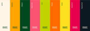
As half of our team mapped out our future website, wireframes, and logistics, our Creative team worked on the logo, colours, brand guide, illustrations, and typography. We poured over different mood boards to nail down the exact feel we wanted to convey, ensuring that Piquant leaned into bright, bold colours, playful typography, simple yet unique illustrations, and a feeling of lush abundance.

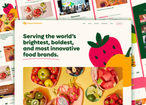
The new website required specifics, not only visually but functionally. We wanted movement, contact forms, and to highlight the many types of services we offered including showcasing our talented designers. This meant a developer would be required to bring it to life. We had a talented creative director, but he couldn’t code an entire site, so we brought in outside help. Though this was another expense, it was one we could not avoid. We found a developer that seemed really affordable for her diverse skill set. Unfortunately, that meant no support or aftercare was offered. She completely ghosted us once the main project was complete, and we needed to bring in emergency support to fix IT issues created by swapping out various platforms to get everything back online.
What good is a gorgeous new website if incoming email for the entire company is not properly routed through the new site host?
That was a valuable (but expensive) lesson. We now have an IT specialist on retainer, but that is an ongoing expense we never budgeted for with the original project.
Capturing images
Once the website structure was clear, we knew we would need lots of fresh photography to make our new site pop. Planning out those shots, finding the right photographer, gathering props, and conveying the exact look in the studio was a huge undertaking; we had budgeted for photography, but not all the labour hours our team spent.
Due to various factors, the rebrand dragged on long enough that by the time everything was completed, we were on our third creative director.
Input from all angles
We could have tightened up the timeline in many places (the process of a full rebrand can be completed and ready to roll out within three months). But we had a few cooks in the kitchen, and a lot of input was considered. That’s the tricky part of having open communication in a small organization. Everyone wants to be heard, and we want to include them because their input is valuable. But there is a stage at which to get that input – and it’s not from start to finish with a big project like this.
Design process for clients
At PQ, we dive deep because we want to get it right. We follow the same rigorous steps when rebranding for a client. Here is the step-by-step process we work through with PQ clients looking for branding, design, and/or a website.
Branding & Design
1. Client Questionnaire
2. Discovery – where we go over the questionnaire in more depth and get insight from the team and customers.
3. Research (Competitors, Target Audience, Brand strategy)
4. Moodboarding
5. Creative Direction & Logo Concepts
6. Finalise
7. Output delivery of the Logo files, Brand guidelines, etc.
Website
1. Research (Competitors, Target Audience)
2. Moodboards
3. Wireframes + SiteMap
4. Design
5. Developer
6. Finalise
We give every design client an estimated timeline and cost in advance. We try our darndest to stick to that. If any issue or expense comes up along the way, we either roll with it or let our client know in advance what their options are going forward so they still have some control over the project. Because, we know that having a four-month project drag on for over a year can seriously impact operations and finances.
We use what we learned from our experience to ensure our clients have a smoother and more predictable ride.


