Client
Piquant Marketing
Service
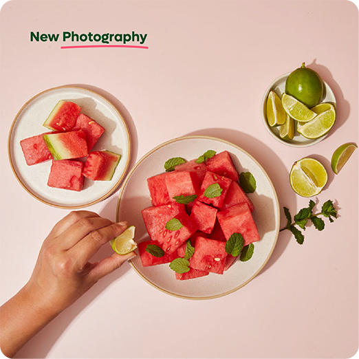
Our PQ Team was broken into the following teams:
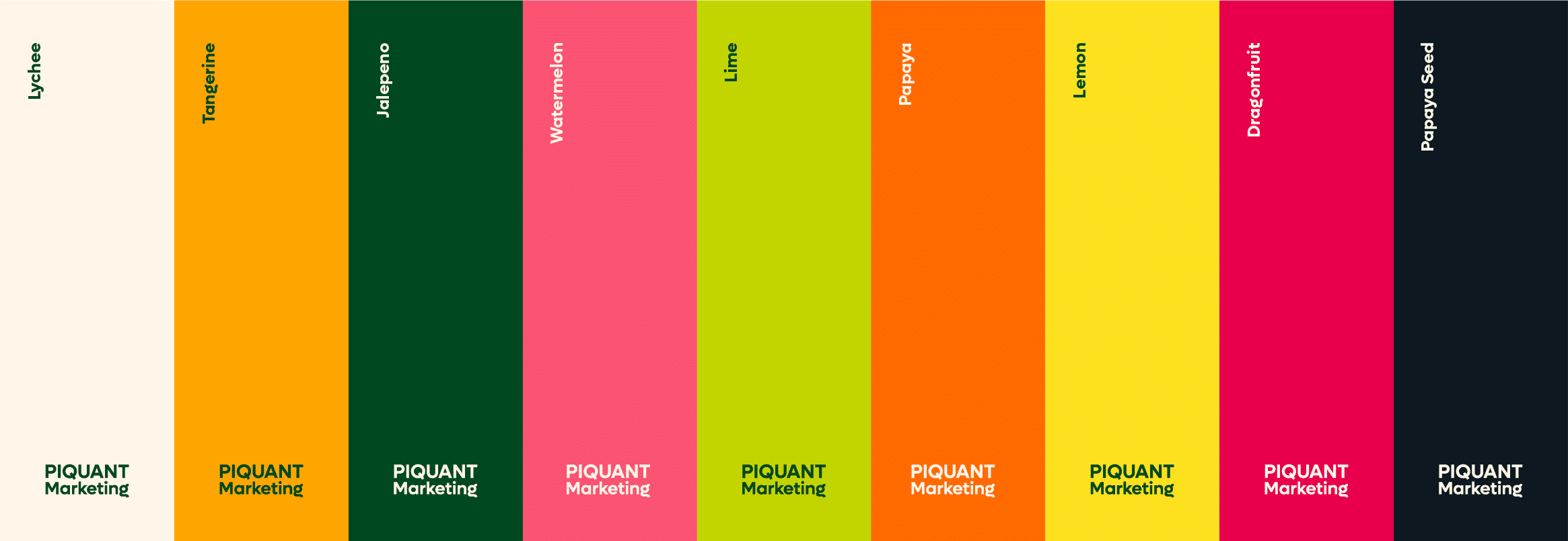
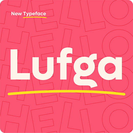
Piquant wanted to make the owner's outgoing personality felt throughout the branding. Bold, bight, fun, and upbeat. So we combined brilliant, saturated colours with fun, in your face typography to capture the feel.
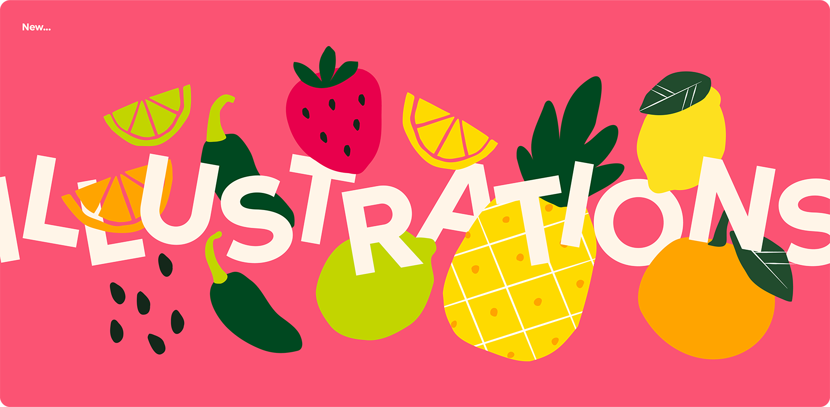
We kept the original lemon trademark to create consistency, but used bold lettering and colouring to create the right vibe with the icon and wordmark. Unique illustrations were designed in the same bright palette with bright colours evocative of both summer and the tropics. They combined elements showcasing food itself as well as the warmth of the team's personality.
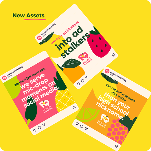
To maintain a consistent feel, we created digital assets with the illustrations, the logo, and wordmark in a variety of colour options. . We played with matching colours and drawings to make sure that bold presence was felt throughout all our assets.
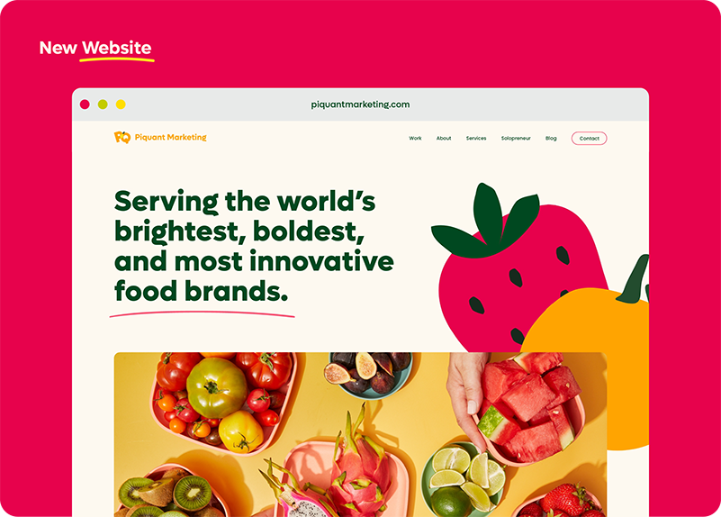
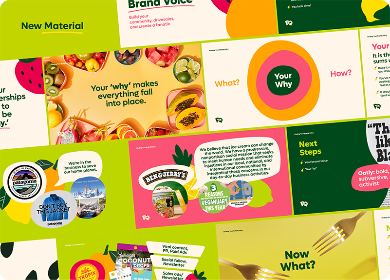
We worked to combine photography with our illustrations to create a unique and larger than life feel. While still focusing on SEO and other features to not only increase traffic to the PQ site, but to keep people there longer. Site traffic as been up YOY an average of 250%
We received consistent positive feedback from peers, clients, and stakeholders
© 2025 Piquant Marketing | All Rights Reserved